Description
- Very light-fast red color, dark
Chemical composition: Chrome-tin-sphere, CaO:SnO2:SiO2:Cr203 and SiO2
Color Index: Pigment Red 233 : 77301, Form: powder, micronized, Density: 3.90 g/cm3
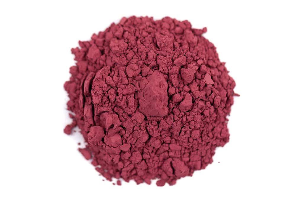
With its dusky pink tone Potters Pink is an unusual pigment. There is a brighter and a darker variant. Both resemble
ultramarine red, somewhat warmer and more broken in tone.
Many modern mineral colors belong to this big group of mixed metallic oxides. This one is its first representative,
invented already in the middle of the 19th century.
Potassium-di-chromate, tin iv-oxide, lime and quartz are measured, thoroughly mixed and burned afterwards. The final
steps are somewhat laborious: thorough washing and careful grinding of the pink chrome tin oxide with its sphene
and/or titanite structure.
After careful washing the pigment is innocuous. The grains are quite hard, due to its quartz content. This can even be
noticed when it is ground very finely.
The opacity is moderate, better in aqueous techniques; it is less suitable for glazing. This pigment is hard to find both in
modern technical literature and in color assortments. One cause the relatively high price, due to the complex
preparation, and the other is the fact, that today this color is only burned in small loads. Around the middle of the 19th
century however it seemed to have been used more frequently. The up to then only pink color, the inconsistent madder
pink, could well be replaced completely by this new light-fast mineral color, beside possible mixtures of white with
dark fiery ferric oxides. In German this color is called “Nelkenfarbe”, carnation color, because it was well suitable for
flower still lives. But the most important use of this oxide pigment is ceramic techniques, where it frequently is used as
sub glaze.
Apart from the use by restorers carnation color can also be quite interesting for artists. Used by itself the colour is not
very interesting. More interesting is it e.g. in oil/tempera mixing techniques. You can paint a ground with carnation
Tempera, and then glaze with transparent organic dark red tones. A glazing with violet -, blue or warm tones can
produce delightful effects. In each case the Pink color should be very well mixed, which is important particularly with
the preparation of oil color. You may also consider first to grind the powder with water and/or turpentine oil as finely
as possible before the actual mixing of the paint. This increases the scope of uses.
The colour corresponds to the rose-red tone of a bright madder lacquer. Potters Pink was originally a solid ceramic
material. In addition it was used for porcelain painting and as printing ink. In water color painting of England in the
18th to 19th Century it was the only light-fast pink.
It is made in a complex high temperature solid reaction of tin oxide, alumina and chromium oxide in presence of chalk
or marble flour. After the reaction the product must be washed carefully to remove the surplus of chromium salts.
Changing the proportion from tin oxide to chromium oxide leads to small nuances in the colouring. It is absolutely
stable in any kind of painting medium.
